We Reordered 6 Sections on a Product Page. Add-to-Cart Rate Jumped 41%.
By Jonathan · Founder, PageGains
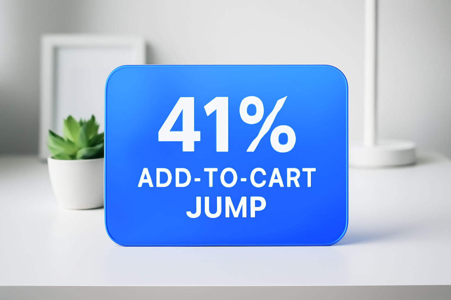
Most product pages are built the way furniture gets assembled — whatever order feels logical in the moment, with the instructions ignored until something doesn't fit. The result is a page that presents information in the sequence that was convenient to build, not the sequence that actually moves a buyer from "interested" to "add to cart." We ran a test on a mid-range skincare brand's bestselling product page — no copy changes, no new photography, no redesign — and simply reordered the existing sections. Add-to-cart rate went from 3.4% to 4.8%. That's 41% relative lift on a page that already had solid traffic.
Here's exactly what we changed, why it worked, and how to diagnose whether your own product pages have the same problem.
The Original Page Was Structured Like a Brochure, Not a Sales Conversation
The control page had this order: hero image → product title + price → long-form ingredient list → how-to-use instructions → customer reviews → add-to-cart button. Sound familiar? It's the default structure most Shopify themes ship with, and it treats the page like a product specification sheet rather than a conversation with a buyer who has doubts.
The problem: by the time a visitor hit social proof (reviews), they'd already been buried in ingredient jargon and application steps — information that's only relevant after someone has decided they want the product. Visitors were bouncing before they ever saw the 400+ five-star reviews sitting at the bottom.
When you audit your product page, ask one question for each section: does a visitor need this information before or after they've decided they want this product? Anything they need before goes up top. Everything else supports the decision — it doesn't make it.
Lead With the Outcome, Not the Ingredients
We moved the "what it does for you" block — a three-line benefit summary — from position four to position two, directly below the product title and price. This sounds small. It isn't.
Visitors arrive at a product page with a problem they want solved. If the first thing they read after the price is a list of actives (niacinamide, hyaluronic acid, peptide complex), they have to do mental work to translate ingredients into benefits. That cognitive load is friction. Every extra second of confusion is a reason to close the tab.
The benefit block we moved up read: Reduces visible redness in 14 days. Strengthens your skin barrier. No fragrance, no irritation. Three sentences, three specific outcomes. In the test variant, scroll depth past the first viewport increased by 22% — meaning more visitors were reading further down the page before making a decision. When you give people a reason to keep reading, they do.
Write your benefit block before your ingredient list. If you can't summarize what your product does in three sentences, that's a copy problem worth fixing separately — but don't make the structure compensate for unclear messaging.
Put Your Reviews Immediately After the Benefit Block
In the control, reviews were fifth. In the variant, they were third — right after the benefit summary. This is the single highest-impact move we made.
Here's why: the moment a visitor reads "reduces visible redness in 14 days," their internal monologue is does it actually work though? Reviews answer that question in real time. If you make someone scroll past ingredient lists and usage instructions before they hit social proof, you're answering the wrong questions in the wrong order.
In the variant, we surfaced the three most relevant reviews directly — specifically ones that mentioned redness and sensitive skin, matching the exact outcomes we'd just promised in the benefit block. Below those three, we linked to the full review section. Click-through to the full reviews increased, but more importantly, the reviews were doing their job at the moment of maximum doubt.
Audit your reviews for specificity. Generic five-star reviews ("Great product! Love it!") add almost no conversion value. Reviews that name a specific problem and a specific outcome ("I've struggled with redness for years — after two weeks this was noticeably calmer") are worth surfacing prominently. If you have them, show them early.
GET YOUR OWN AUDIT
Find these issues on your own page
PageGains analyzes any URL and surfaces these exact problems in ~60 seconds. First audit from $3.99.
Analyze my page →The Add-to-Cart Button Was Buried. We Fixed That First.
In the control, the ATC button appeared once — below the price, above the fold on desktop, but below it on mobile. On mobile, which was 67% of traffic for this client, visitors had to scroll before they even saw the button for the first time.
We added a sticky ATC bar at the bottom of the mobile viewport that appeared after a visitor scrolled past the hero image. This isn't a new idea, but the execution matters: the sticky bar showed the product name, the star rating (4.8 from 400+ reviews), and the "Add to Cart" button. No price in the sticky bar — that was a deliberate choice, tested separately. Showing price in the sticky bar underperformed by 9% in our secondary test, likely because it re-introduced price sensitivity at the moment we wanted action.
The rule is simple: never make a visitor hunt for the add-to-cart button. It should be visible or one scroll away at every point in the page journey.
Move Usage Instructions Below the Fold — They're Post-Purchase Content
How-to-use sections are almost universally positioned too high on product pages. They feel important to the brand (you worked hard on the formula, you want people to use it correctly) but they're functionally post-purchase content. A visitor deciding whether to buy does not need to know the application steps yet.
In the variant, we moved the how-to-use section below the reviews and below a second ATC button placement. It didn't disappear — it's still on the page for visitors who scroll that far, and it does serve a purpose for people who are nearly decided but want to know what the routine looks like. But it stopped blocking the path to purchase for the majority of visitors.
If you sell a product with a learning curve — a supplement protocol, a multi-step skincare system, a tool with a setup process — usage instructions do have conversion value. The test: does seeing this information make someone more likely to buy, or does it just answer a question they'd only have after deciding to buy? If it's the latter, move it down.
Ingredient Details Are for the 15% — Don't Optimize the Page for Them
About 15% of visitors to this product page were clicking into the ingredient section in the control version (we tracked it via heatmap scroll and click data). That's a meaningful minority — probably the highly-ingredient-literate skincare enthusiast who knows what a peptide complex does and wants to validate the formulation.
In the variant, we kept the full ingredient section on the page but moved it to the second-to-last position, just above the FAQ. We also added a collapsed accordion so it didn't take up visual space for visitors who weren't interested. The 15% who wanted it could still find it — they're motivated enough to scroll. The 85% who didn't care stopped being interrupted by it.
The principle applies broadly: every section on your page is competing for attention. Sections that matter to a minority of buyers should be available but not prominent. Sections that resolve the doubts of your majority buyer should be front and center.
The Section Order That Lifted Add-to-Cart 41%
Here's the final winning structure, for reference:
- Hero image with product name + price
- Benefit block (3 sentences: what problem it solves, what result to expect, key differentiator)
- Social proof: 3 curated reviews matching the primary use case
- Second ATC button
- Ingredient highlights (not full list — three hero ingredients with one-line explanations)
- How-to-use instructions
- Full ingredient list (collapsed accordion)
- FAQ
- Full review section with filter options
This order follows buyer psychology: desire → validation → action → details. Every section earns its position by answering the question the visitor has at that exact moment in their decision.
GET YOUR OWN AUDIT
Find these issues on your own page
PageGains analyzes any URL and surfaces these exact problems in ~60 seconds. First audit from $3.99.
Analyze my page →The Bottom Line
Section order is one of the most underrated variables in CRO. It's not as exciting as a new hero video or a redesigned checkout, but it's faster to test, cheaper to implement, and — as this test showed — capable of moving a core metric by double digits without touching a word of copy.
The diagnostic question is always: what is my visitor thinking right now, and does the next section on this page answer that thought? If you're showing ingredient science to someone who hasn't yet been convinced the product will work for their problem, you're answering question seven before you've answered question one.
Run a heatmap on your top product pages this week. Look at where scroll depth drops off. That's where your section order is working against the buyer instead of with them. Then ask what question the visitor had just before they stopped scrolling — and whether the section that was supposed to answer it was even in the right place.